Date:
Timeline:
Project Role:
Location:
Published since:
2022 - 2023
1 year
Product Designer
Mexico City
September 2018
This project was carried out at Telefónica México, the application is in charge of the eCare team to which I belong. Received supervision from the Director of Digital Channels. This project was a great challenge due to all the work, findings and achievements obtained.
The application was a project that was built without prior planning by people outside of UX/UI design, until work began on this project.
In this project you can see the redesign of the interface of the Movistar MX App, which resulted in an increase in the company’s sales and in better delivering its services to our customers.
Movistar, a prominent telecommunications brand under the Telefónica Group, has been a key player in Mexico’s communication landscape since its launch in 2004. Offering a diverse array of services that include mobile and fixed-line voice, broadband internet, and data solutions, Movistar caters to millions of customers across the country.
With a strong focus on innovation, the company consistently invests in expanding its network infrastructure to enhance connectivity and customer experience. Movistar’s commitment to digital transformation enables it to provide cutting-edge solutions that meet the evolving demands of consumers and businesses alike.
Additionally, the brand emphasizes social responsibility through various initiatives aimed at promoting digital inclusion and sustainable development in Mexico.
At Movistar, there is a team called eCare, which coordinates and aligns sales goals through the WhatsApp channel, web and the mobile app. These channels are the most important for the company, as they generate the most revenue, surpassing retail stores and customer service centers (CACs).
Job Title
Digital Media Lead (UX/UI Designer)
Level of Responsability
Digital Media Lead (UX/UI Designer)
Responsability
At Movistar’s corporate office, I was the only UX/UI designer in the team responsible for the app, WhatsApp communication channels, and some landing pages on the Movistar website.
Activities into the Company
Below are some details about my role in the team:
Interacted with both internal and external stakeholders.
Worked remotely with the design team across Latin America (Spain, Argentina, Colombia, Peru, Chile, etc.).
Designed new sales flows and improved features for the app.
Participated in creating the roadmap alongside PMs, POs, and the Director of Digital Channels, negotiating the direction of the app across Mexico.
Prioritized tasks according to customer needs and business objectives.
Presented progress and app changes to all departments mentioned above during Demo Days.
Aligned the app’s direction with the goals of other departments through input from PMs.
Deliverables included MVPs, completed features, or any phase already implemented in the app or WhatsApp.
Adversiting Team
Maintained constant communication with the advertising team, who ensured brand alignment regarding fonts, colors, images, videos and icons.
Legal
Worked with lawyers to review terms and conditions for new app flows. If changes were made, we ensured they complied with legal standards or adjusted the terms as needed.
Latin American UX Team
Had direct and continuous interaction with the Latin American design team to align their design system with Movistar’s app requirements. Additionally, I presented app flows that could be related to other countries. If a design flow I implemented was successful, it was used as a template in other countries to drive success elsewhere.
Collaborating with Other Departments
For any new project to be implemented in the mobile app or WhatsApp, teams such as IT, Customer Experience, Marketing, Logistic, Call Center, etc., needed approval from the Director of Digital Media.
Postpaid and Prepaid
Consulted these teams to improve phone plan sales and recharge processes. We also updated pricing tables in the app and WhatsApp when there were price changes.
Development teams
I delivered designs in Figma to my PM and to the development team, and according to the programming roadmap, they would implement the App and WhatsApp flows in code.
Collaborated with my PMs to manage external development teams (35 programmers) to approve programming progress. I reviewed the design advances on various devices before giving my approval for the app’s deployment. In case of questions or issues related to design functionality, the development team would request a meeting with me.
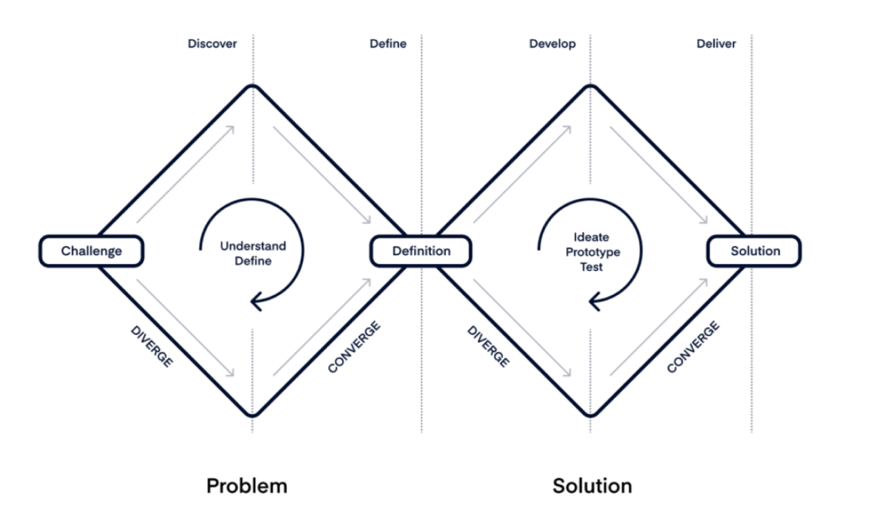
Methodologies Used
We applied the Double Diamond Method to organize the design process into clear stages
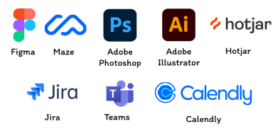
UX Design Tools
I used Figma for prototyping, Google Analytics to understand user behavior, and Maze for card sorting tests. I scheduled meetings with people through Calendly and Teams to conduct user testing; Jira to validate copies of the terms and conditions with the legal team, Hotjar to visualize heatmaps, and finally Photoshop and Adobe Illustrator to edit and export brand images and icons.
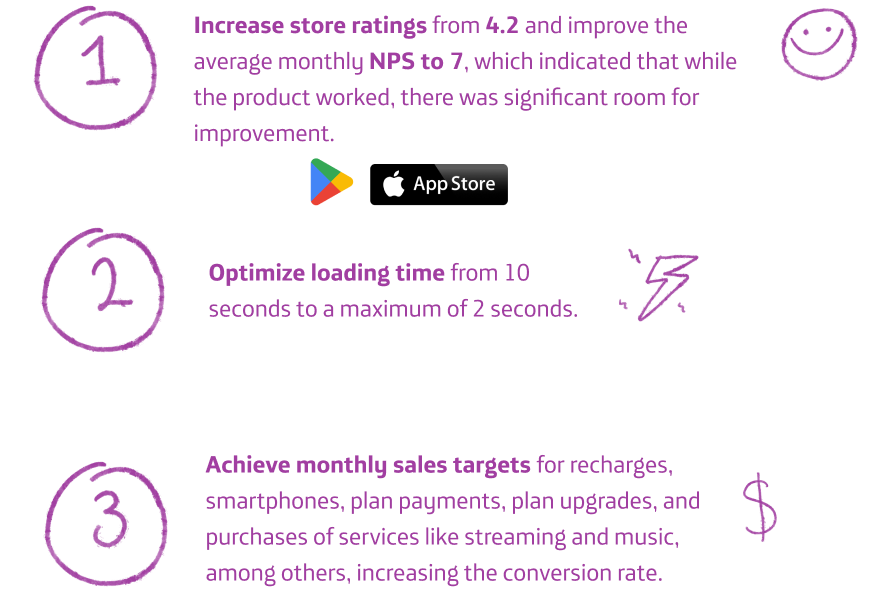
In this phase, the main problems to be addressed in the app redesign were defined.
Goal
Business priorities
KPI’s
Hypothesis
Why does the need arise to
Redesign the application?
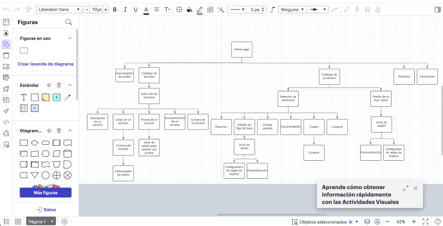
App sections
The goal was to optimize the most used flows in the application.
1
If the availability and functionality of the app were improved, then the NPS and app ratings would improve.
2
If we optimize the app’s backend, then the loading time would be reduced, and the app would be faster.
3
If we reduce the number of steps in the funnel for the main sales flows, then the sales volume will increase.
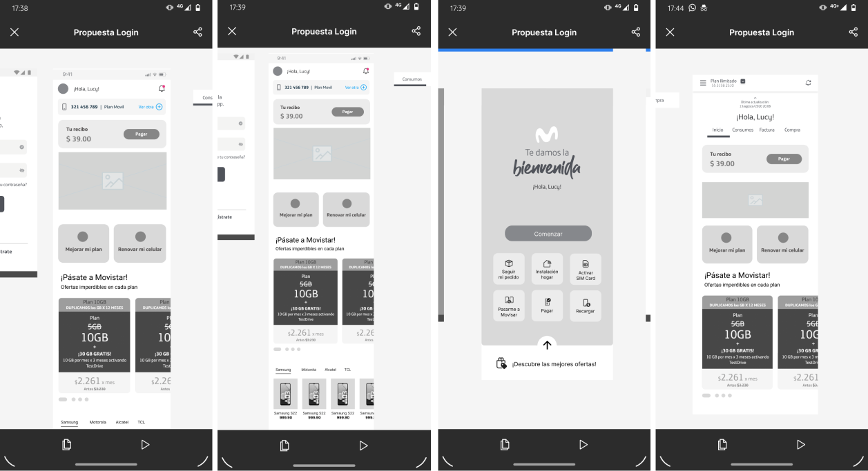
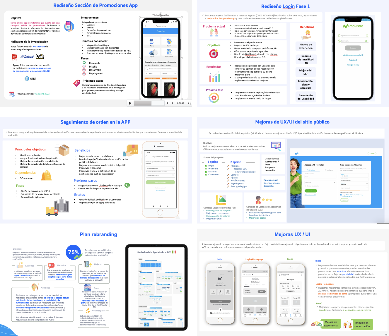
These are the features I worked on in the redesign of the application
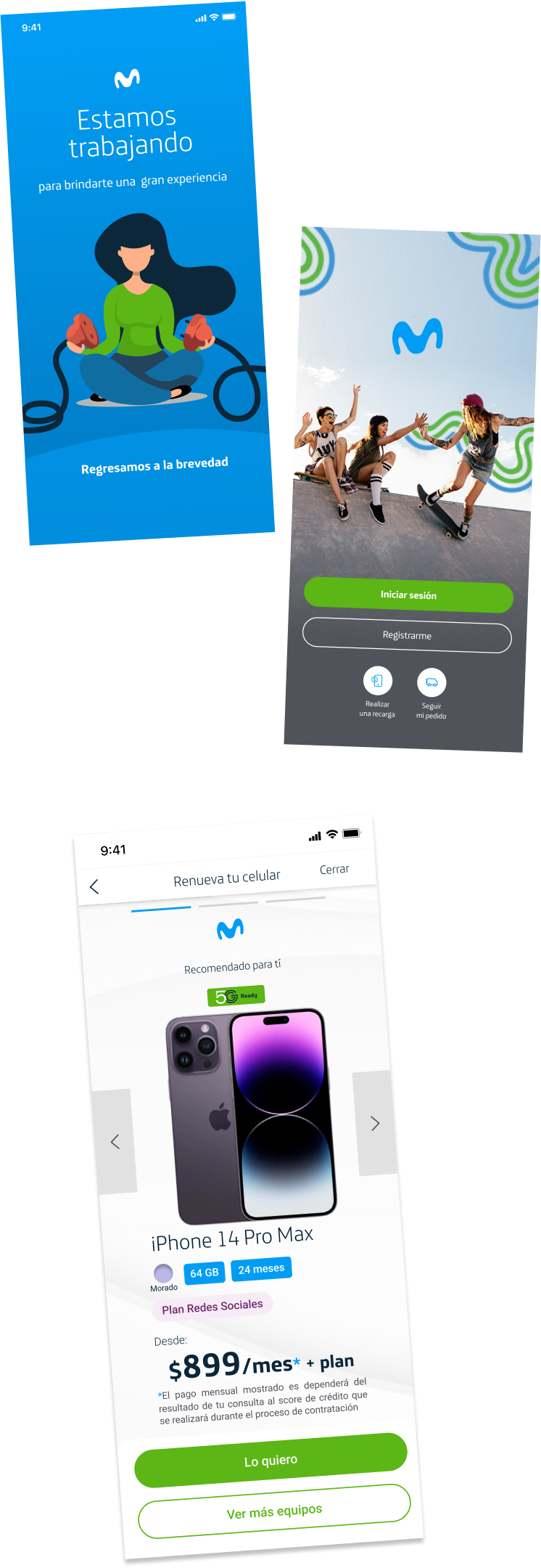
Splash
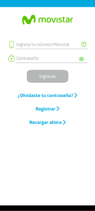
Login
Onboarding
Dashboard
Home (New)
Notifications
Menu (New)
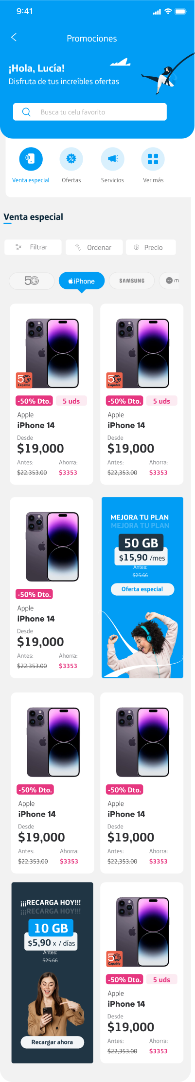
Purchase a cellphone plan
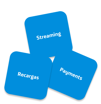
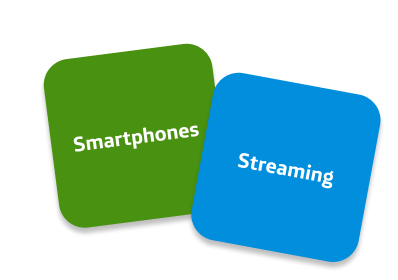
Shop Streaming and Services (New)
Recargas
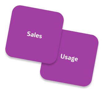
Usage
Configurations
Payments
Upsell
Warnings
Change your number to other company
Movistar Libre
Frequently asked questions
Public Site (New)
Order tracking (New)
Push
Notifications
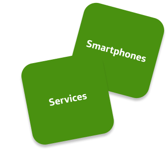
Shop
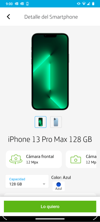
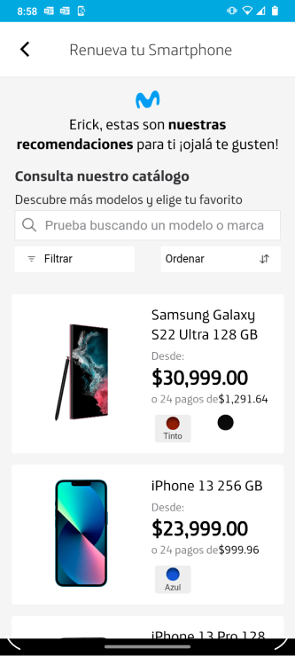
Smartphones
In this phase, we develop the problem through different methodologies
Customer
Feedback
Target Users & User Persona
Brand Positions map
Heuristic
Evaluation
Card Sorting
User Journey Map
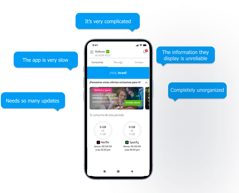
This opinions from dissatisfied customers regarding navigation and lack of clear information
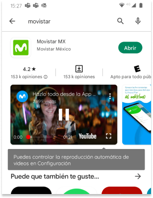
This photo shows how the application was when I was assigned to redesign the application
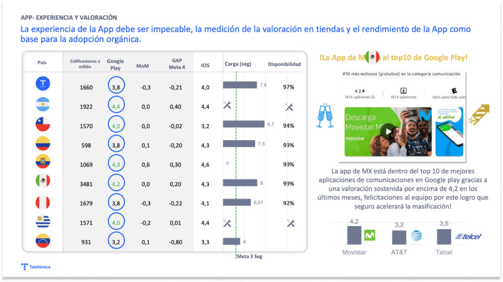
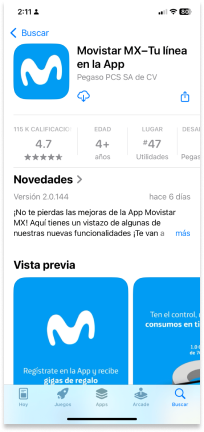
4.2
Rating on Google Play Store and Apple App Store
At that time, the app had over 153k reviews in the app stores, and some of the comments from our customers were the following…
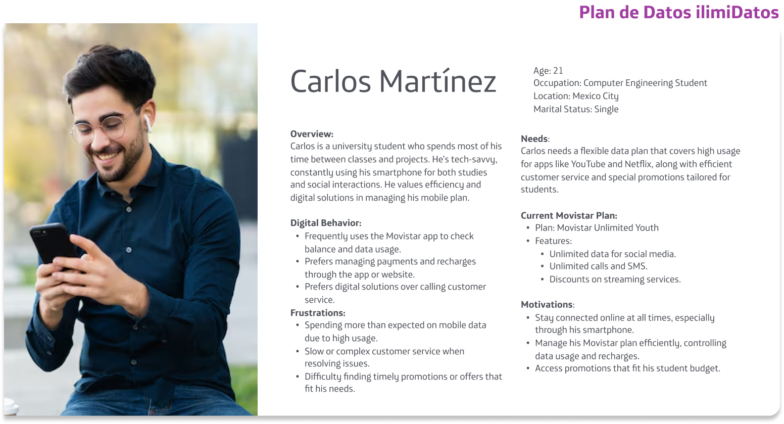
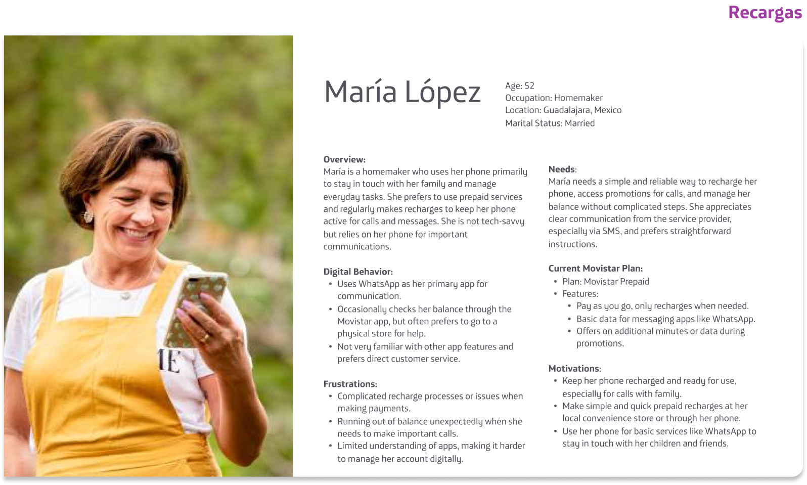
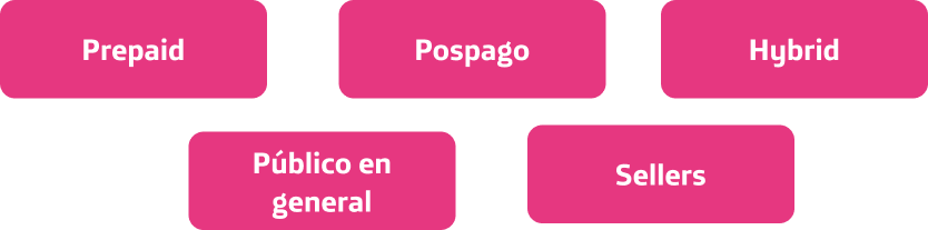
Movistar users in Mexico and Latin America seeking a smooth and easy experience to manage their phone services.
The target users for the Movistar app redesign were primarily customers of Movistar Mexico and Latin America, ranging from tech-savvy individuals to those less familiar with digital tools.
In all of Mexico, Movistar has over 24 million customers.
We define these types of users with the findings obtained from the Google Play and Apple Stores, with Call Center calls, and with the business definition.
Prepaid:
Make recharges and consume what you pay
Usually buy internet packages
The means of use is through digital sites or in physical stores
Pospago:
You have a phone plan
You usually bought a cell phone from the company
Your plan is renewed every year
Sellers:
They use it to recommend customers, and also for personal use.
They are interested in knowing their consumption.
They can recommend promotions and earn incentives.
Hybrid:
It has a rental plan, but if you run out of data, you can recharge it to buy or not a package and continue browsing.
It has a plan that is renewed every year
Make your payments through a Customer Service Center or use a digital payment method or our digital platforms
General public:
Only one-time purchases
They usually use smartphones
We have no record of them
For testing purposes, we randomly contacted our users via email and phone calls, asking if they would like to be part of a group that tests some Movistar products.
Once these users agreed, they were stored in an internal database, which was referenced whenever a test was required. However, there wasn’t always an incentive for each user, so the tests depended on their availability.
We usually aimed to have tests with at least 30 people; however, not all 30 would always respond. This is why the flow of participants varied in some tests.
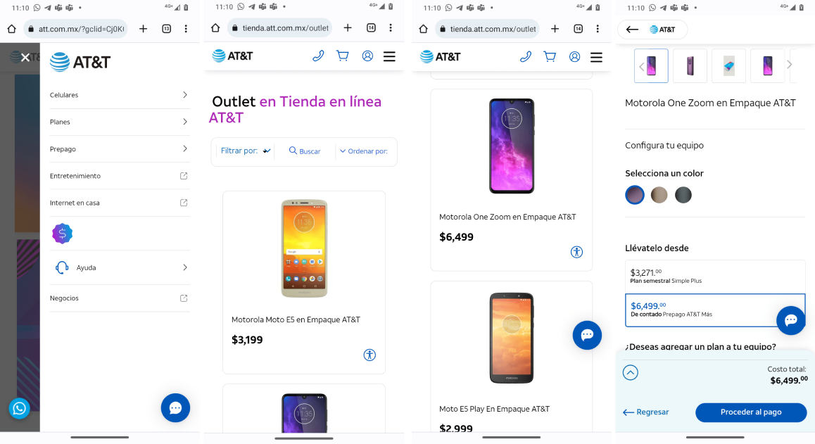
Here are some screenshots of the competitor with the most customers in Mexico in the telecommunications sector.
As a UX designer, my first approach was to conduct a heuristic evaluation of the app, where I assessed the functionality, interface design and user experience throughout the application.
From the application that existed, I got the following results
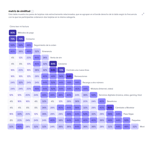
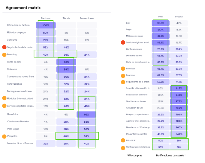
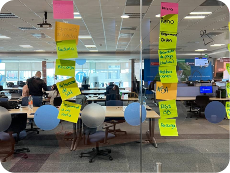
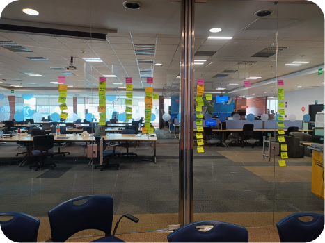
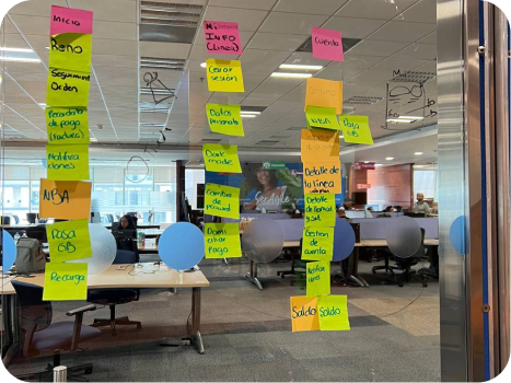
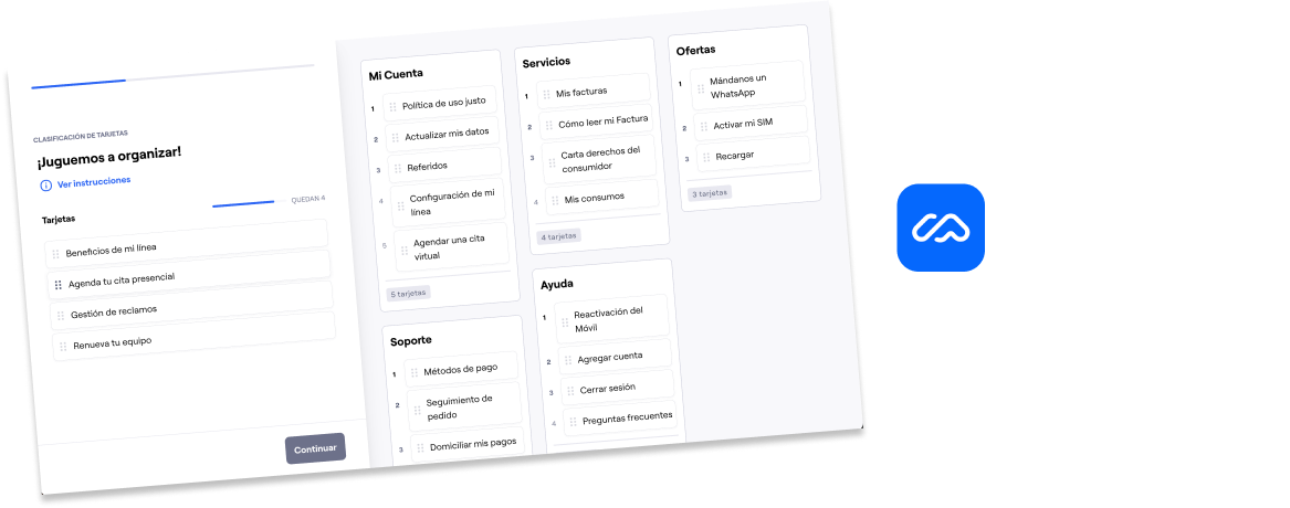
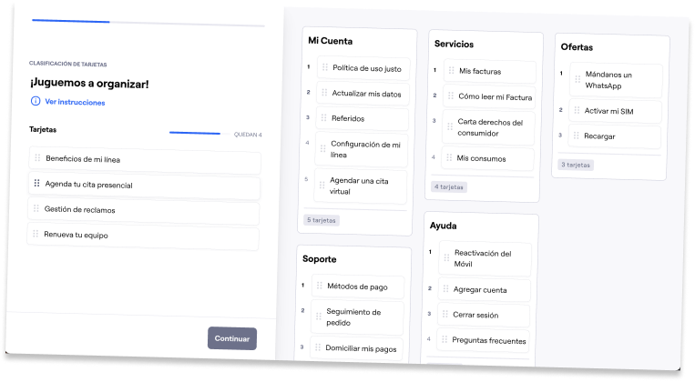
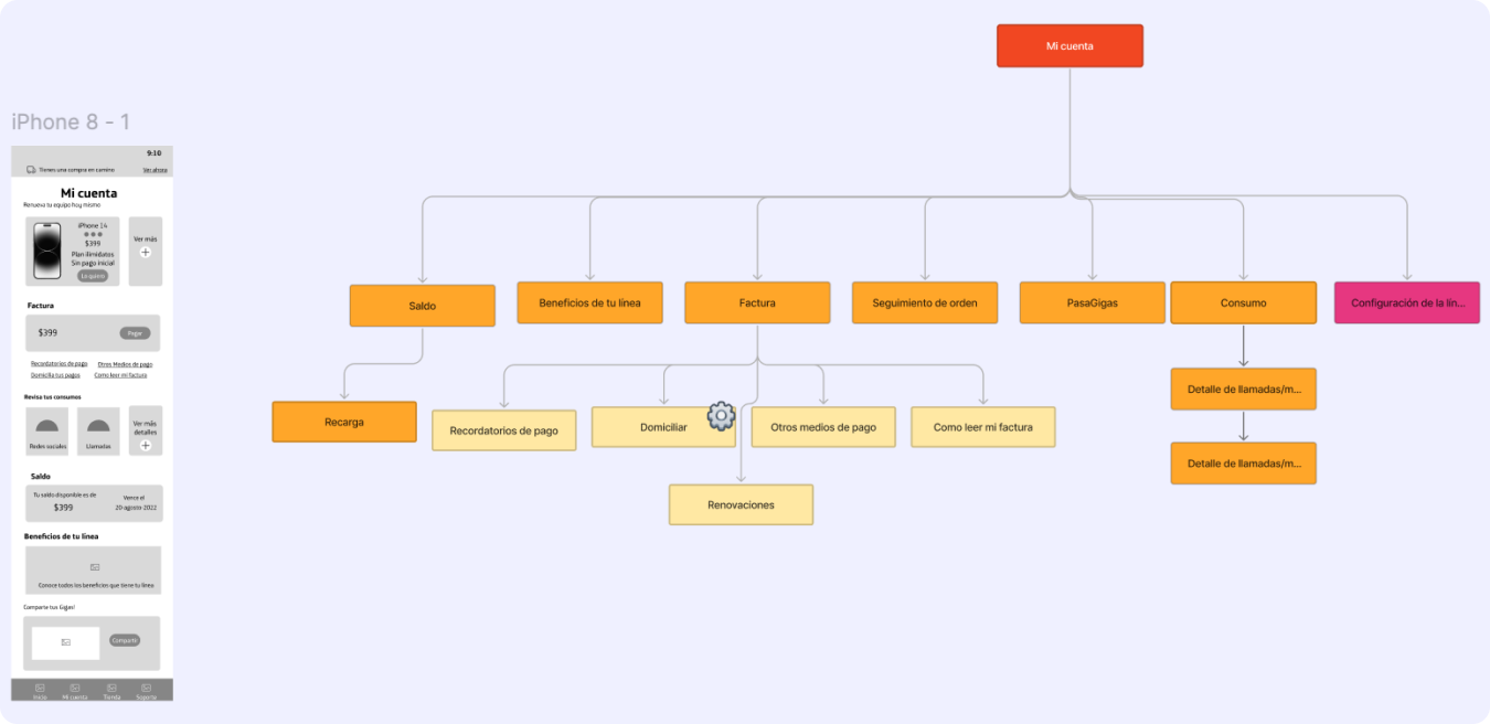
I used card sorting to organize the many categories within the application. This straightforward method helps identify which categories are most important to users through card organization. The exercise involved prioritizing the most significant categories and assigning the functionalities users expected to see within the app.
For this Card Sorting case, the goal was for participants to identify the main sections of the redesigned menu. Within each section, they would organize the most important categories of the Movistar app. This approach aimed to get an initial understanding of what our customers expect to find in the app, specifically in the menu.
From the application that existed, I got the following results
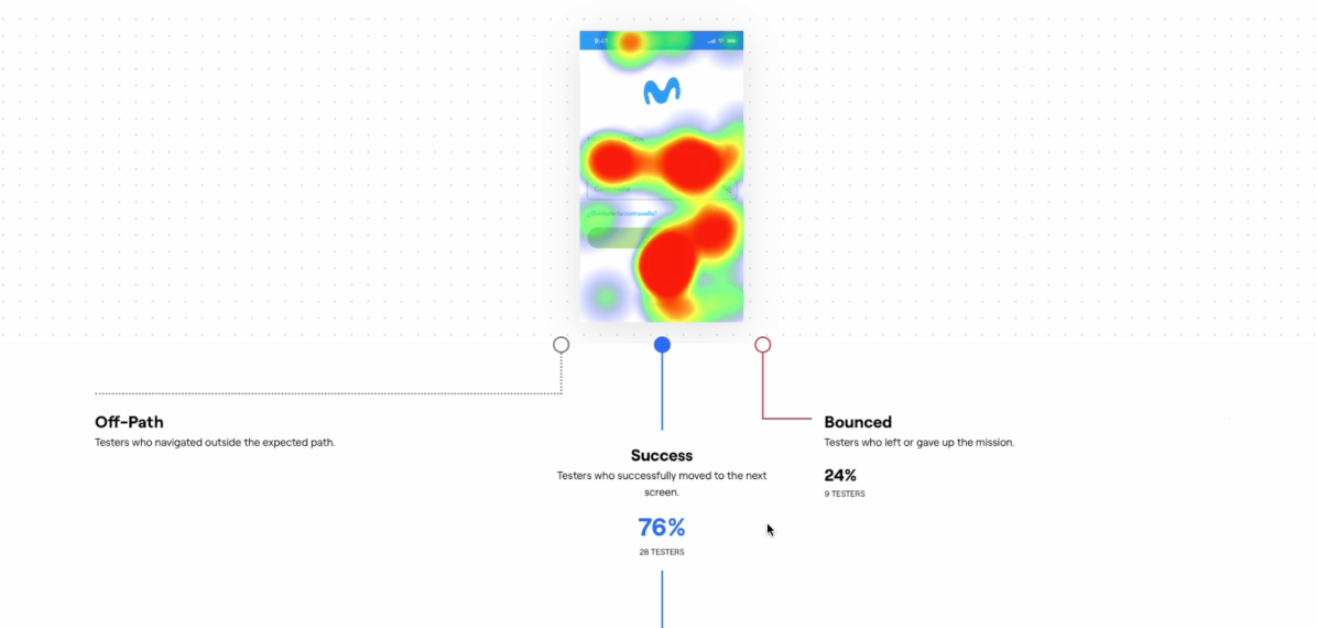
A series of usability tests were conducted remotely via Maze. The users participated from July 12 to 30 of 2023. A total of 23 users in Mexico took part, including both Movistar customers and non-customers.
I performed a card sorting with the business perspective in order to create a menu that aligns with both perspectives. However, I wanted to know how stakeholders expected to find the application, aligned with their sales objectives.
Once I had both sets of responses and maps, I conducted a final card sorting exercise. With the help of the design team from Latin America, we combined the insights into a single card sorting to finalize the requirements for the new menu.
I conducted a card sorting with the business team, where all the app sections appeared on individual cards. Each team member wrote how the ideal app for the business would look.
To find the best option for both the business and the app users, we decided to design two different types of user journeys. The goal is to combine the two maps into one, so we can move forward with designing a menu.
Likewise, the user journey map was created from the perspective and needs of the business through several sessions with designers, the advertising team, stakeholders, business team, etc.
Also, the app has 4 types of profiles. That’s why there are different types of maps, because some features do vary by user type. However, in general, the 3 types of users have the same sections in the app.
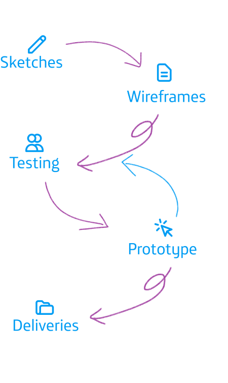
Proposals for final design and testing began to be developed
Sketches
Wireframes and
Information architecture (IA)
Testing
Remote Usability Testing
Hypothesis to evaluate
Interview testing
A/B Test
Because they allow for quick, low-fidelity iterations to visualize ideas and concepts early on. Sketches help in rapidly exploring different design options, improving the menu structure, and aligning the team’s vision before moving into more detailed design phases. This saves time, enhances collaboration, and ensures that the redesign direction meets user and business needs from the start.
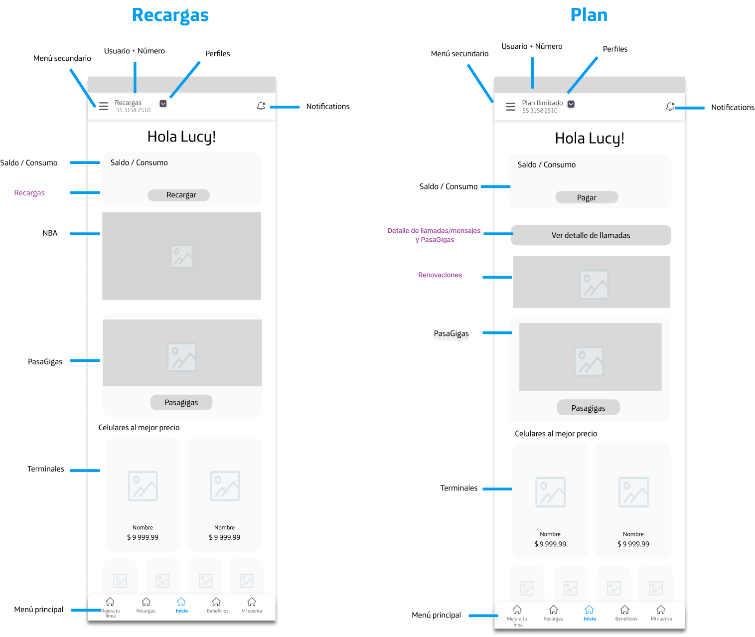
This is an example of the wireframe that was created for the application’s home screen
Relationship between User Journey Map and Wireframes
Based on the above, we started creating different types of wireframes, which will capture all the functionalities we want to change and improve for the app.
Wireframes of the new structure, explaining how information was reorganized to improve accessibility and navigation.
Relationship between User Journey Map and Wireframes
We used testing tools like Maze to validate the design with real users, allowing us to detect and correct potential issues before final implementation.
Once we completed the initial findings with wireframes, we conducted different tests through remote user interviews. Each participant was assigned a different task, which they had to complete in real-time, in order to identify findings and test if the redesign of the app was effective.
Validate the usability and adoption process for prepaid, home, and postpaid users in Peru with a new menu for the app.
Validate the new menu proposal with customers in Mexico (mobile and home), focusing on meeting user needs through search with quick access options.
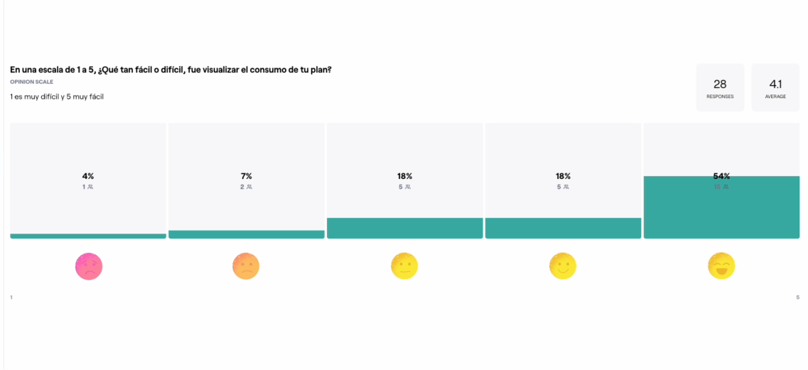
Learning, memory, errors, and satisfaction.
Movistar or non-Movistar users in Mexico with postpaid or prepaid plans
Aged 18 to 60 years
Mexico 🇲🇽
Maze
Remote Test
10 users
No incentive
To improve the optimization of the application, a backend analysis was requested from the development team
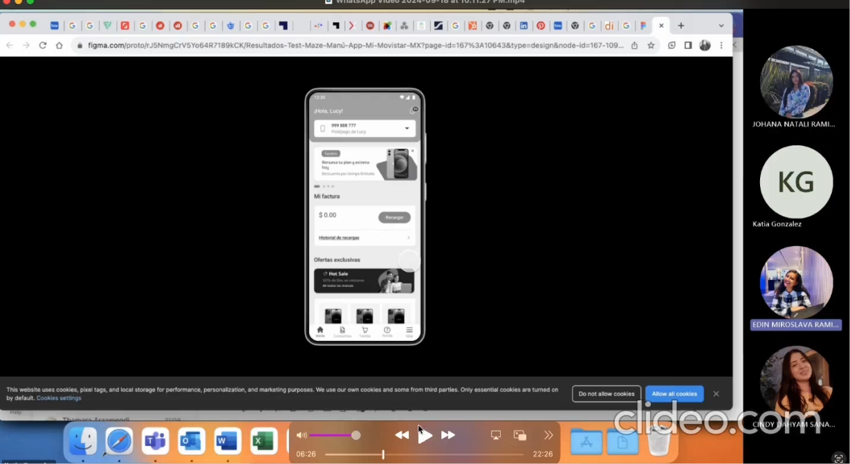
Through a video call, we scheduled different appointments with users of the Movistar app to understand how they feel about thesechanges in the app. These tests were led by me, with the support of my design colleagues from Colombia, who not only helped me with feedback but also provided support to gather insights from each interview.
Through a video call, we scheduled different appointments with users of the Movistar app to understand how they feel about thesechanges in the app. These tests were led by me, with the support of my design colleagues from Colombia, who not only helped me with feedback but also provided support to gather insights from each interview.
Thanks to the feedback obtained from participants, we made decisions on whether to proceed with a particular preference or a combination of both, depending on the results in this case. The tests were generally conducted with users from our database who were already familiar with the redesign. We scheduled a video call with them for no more than 20 minutes, during which we also performed a test in Maze. The link was shared with them during the call, and we asked them to share their screens as they started the test.
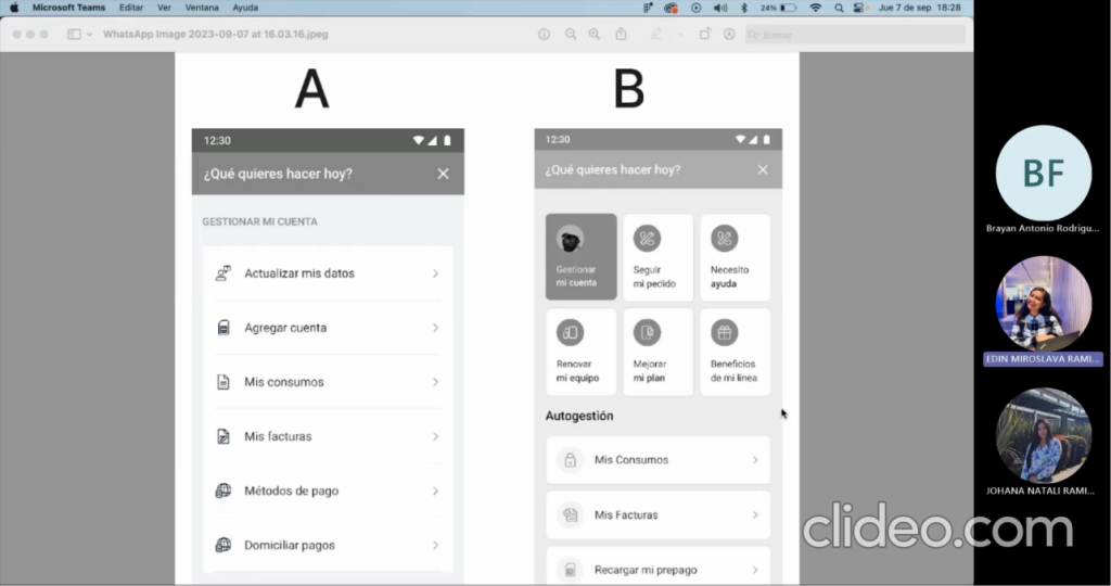
Next, I present an example of how we collected feedback and results from the A/B test, and how in this case we took a sample of 5 users. With their feedback, we reached some conclusions that guided us in redesigning the menu in the Movistar app.The tests were generally conducted with users from our database who were already familiar with the redesign. We scheduled a video call with them for no more than 20 minutes, during which we also performed a test in Maze. The link was shared with them during the call, and we asked them to share their screens as they started the test.
It is clear and easy to access the “Order Tracking” shortcut section.
Users like to receive brief notifications about the status of their orders, similar to how Mercado Libre does it.
3 out of 4 users easily found the quick access to “Need Help” — FUNCTIONED: YES
3 out of 4 users preferred the quick access option in the menu, finding it intuitive — FUNCTIONED: YES
The majority of users preferred option A of the menu, which is grouped.
Users would like to receive notifications via SMS or through the app. They find it interesting to access “Store” and be able to see a history or order tracking for the purchases they’ve made.
Users do expect to see contact numbers, but each operation must be validated and the self-service channels should be checked. They suggest providing an email or encrypted WhatsApp number.
Review the titles of the categories: Only 1 user preferred option A because they understood the category terms better. For example, they found “Self-Service” confusing.
An onboarding process should be implemented to show that more details can be expanded in each section.
I continued to iterate every part of the redesign process, for example every funcionality that the project needs in order to have a stable MVP. This follows the roadmap and delivery dates. Every time that we iterated this process with users, we had to provide proof and feedback with the business that its design were aproved by them.
All of these steps were made through the login, homepage, stores and plan purchase pages, etc.
The project deliveries were made with the findings obtained from the research
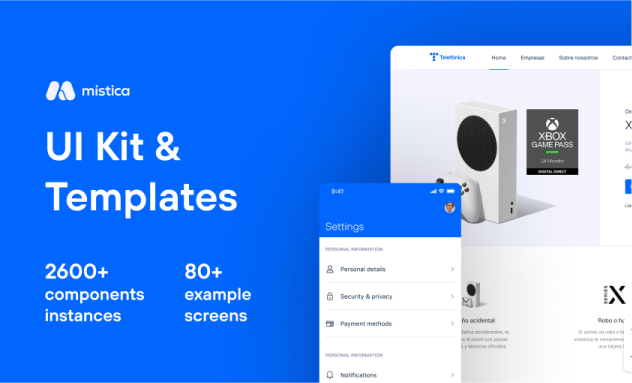
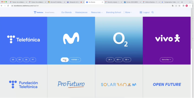
Made by Telefonica Movistar España, the Mistika design system is the one that is followed by every Movistar digital product including Latin America
However, the design team in Latin America developed its own design system to standardize and ensure consistency across all applications developed in Latin America. This is how designers from Latin America shared with me, through Figma, the components I needed to use for the designs I created for the Movistar Mexico app.
At Telefónica Movistar, I had access to an image bank, wallpapers, audio files, videos, and other multimedia resources for Virtual Reality, which were available for free use whenever I needed them.
The advertising team, in collaboration with Latin America, decided to implement a rebranding, thereby prioritizing the color blue, changing the icon, and updating the typography that belongs solely to Telefónica
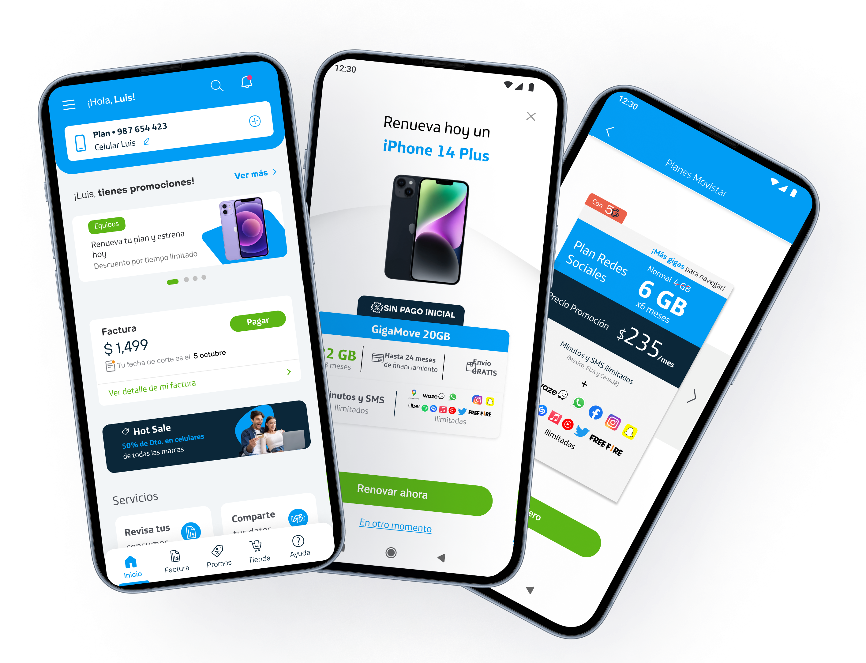
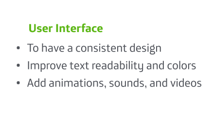
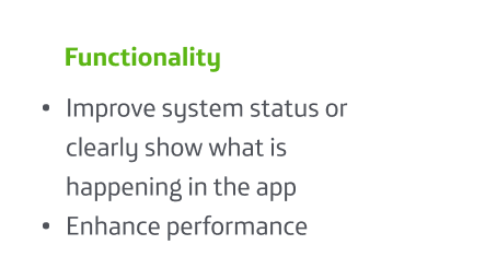
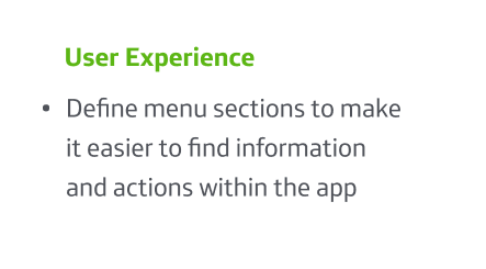
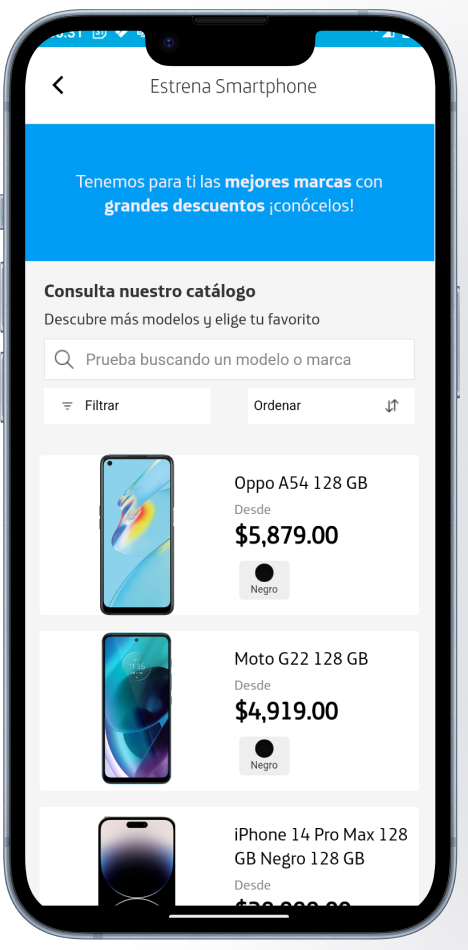
Screenshots of the final version of the app, highlighting improvements in:
Clearer and more organized navigation
Visual design aligned with brand identity
Simplified purchasing process
This is the most current version we worked on for the Movistar redesign 2023. With the previous insights and wireframe proposals, they were approved by the stakeholders (Business, Advertising, Developers, Customer Experience, etc.) and the design teams from other countries like Colombia, Argentina, Chile, Peru, etc. to achieve this final version where our customers will be able to see their usage.
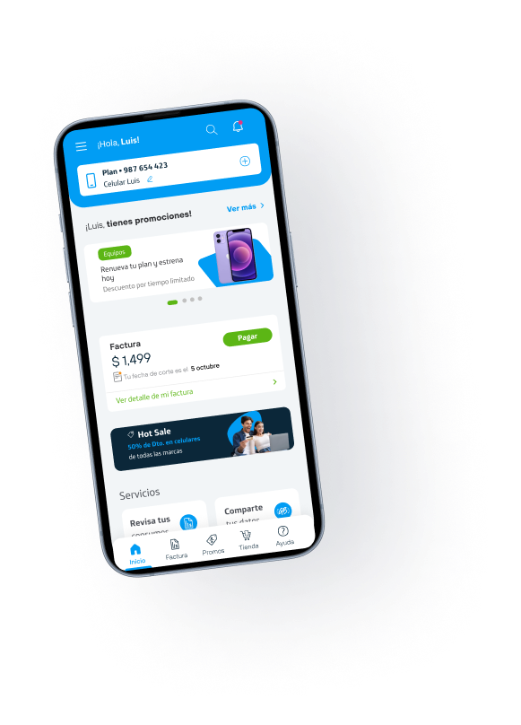
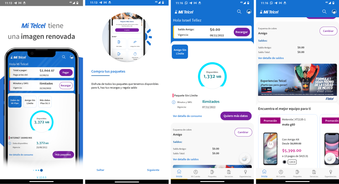
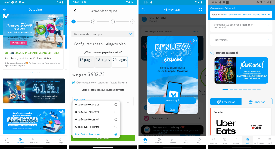
These are some of the screens from the previous version of the application
Below, I show how I presented my deliverables during a sprint meeting, where a general progress update was given to all departments of Movistar MX. This included updates on the app’s new functionalities and the progress of the app redesign.
Sales from phone renewals, phone sales through the store, plan purchases, and top-ups improved drastically, making the app the main sales channel in Mexico.
Of the company’s total sales came from the Movistar MX app
We became the app with the highest sales increase in all of Latin America
We optimized the app, making it faster
We ensured the availability of the app during the 2022-2023 period
We increased downloads from 8 to 10 million
We improved and maintained our customers’ NPS rating regarding the mobile app.
The advertising team was able to standardize the brand change across all digital channels, including the app, the website, and WhatsApp channels.
The redesign helped integrate new features and improve the app’s organization like Chile, Argentina, Colombia, etc.
We were able to meet the sales targets per channel through these changes.
The Movistar App ranked among the top 10 apps in Latin America.
Increased sales of higher-value plans by 5% compared to the previous Q.
Below, I show how I presented my deliverables during a sprint meeting, where a general progress update was given to all departments of Movistar MX. This included updates on the app’s new functionalities and the progress of the app redesign.
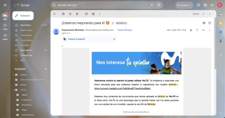
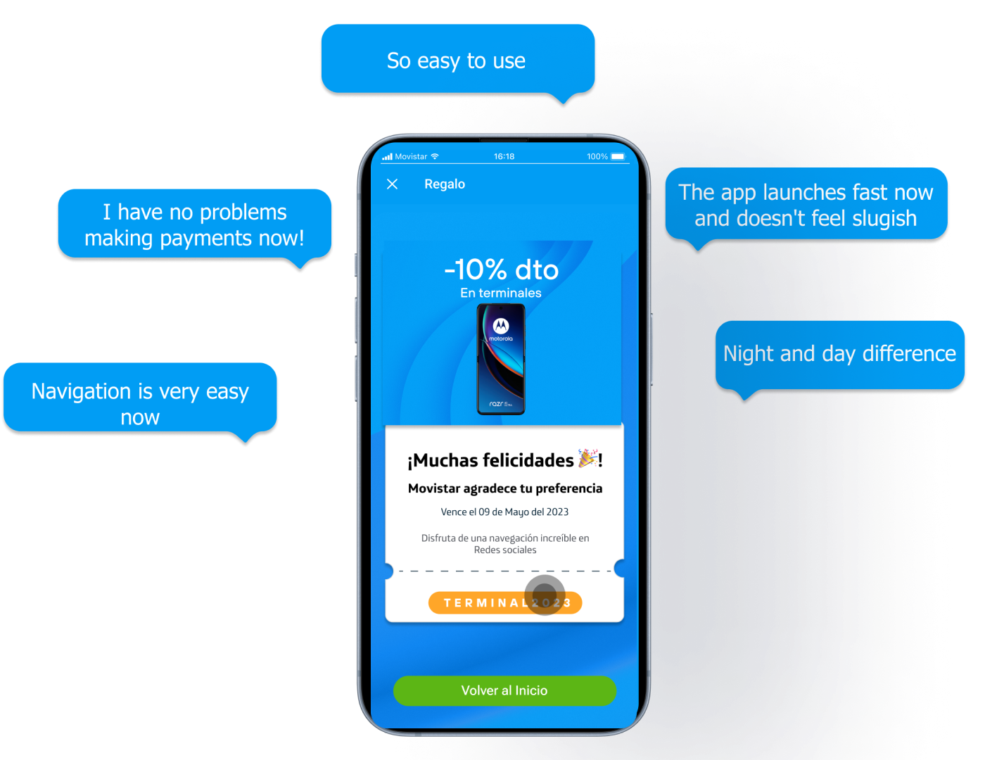
Positive comments following the redesign implementation, highlighting improvements in user experience and usability.
We completed the final version of the prototypes, which were implemented in the application, thanks to the development team.
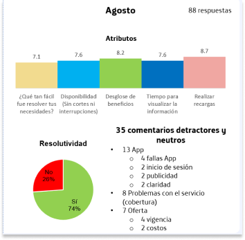
However, the real moment when we saw that the redesign worked was when we received the NPS survey results, which were sent via email with customer feedback. These were questions sent through email and SMS, where people responded a brief survey about the new functionalities of the app.
Another way to verify the progress or lack of the changes made was by checking the dashboard of the Google Play Console. There, we could measure the flow of active and inactive users, session duration, types of complaints, and the ratings left by our users on the app.
Our users constantly provided feedback, and although I don’t have evidence of the console at the moment, this is another tool I used to measure the effectiveness of design changes and flows in the digital channels and the app.
Rating on Google Play Store and Apple App Store
At that time, the app had over 153k reviews in the app stores, and some of the comments from our customers were the following…
Our users constantly provided feedback, and although I don’t have evidence of the console at the moment, this is another tool I used to measure the effectiveness of design changes and flows in the digital channels and the app.
Another way to verify the progress or lack of the changes made was by checking the dashboard of the Google Play Console. There, we could measure the flow of active and inactive users, session duration, types of complaints, and the ratings left by our users on the app.
Our users constantly provided feedback, and although I don’t have evidence of the console at the moment, this is another tool I used to measure the effectiveness of design changes and flows in the digital channels and the app.
Main Challenges
Having an organized roadmap since the project was very large
Constantly validating with users which was the best path for the design of the app’s flows
Negotiating with stakeholders on project timelines and priorities, considering the needs of our customers
Coordinating work with many different departments
Learnings
We needed to constantly check on our users because they experienced changes that we couldn’t measure in the tests.
Despite the design improvements, if the phone service doesn’t work, it can affect our customers’ experience, hindering progress in the app.
The app has already been adapted to the new brand image, and even though the project was completely redesigned, I have no doubt that it will continue to grow and need improvements over time.
That’s why I aimed to establish clear and concise parameters and documentation outlining how to follow the design guidelines and processes to improve future flows of the Movistar MX app.